WARM MODERN
Tucked in between the San Jose Neighborhoods of Willow Glen and the Almaden Valley is Robertsville. As the San Jose Area was transforming from the Valley of the Heart’s Delight into Silicon Valley, orchards gave way to tracts of homes by a multitude of developers vying to be a part of the economic and housing boom of the 1970’s. Larger family homes of this time period were focused on creating cozy places where families could huddle together for meals and activities. The owners wanted to take their home built in the 70’s under that ideology and update it for the 21st Century. Royer Designs worked closely with the family to remove light blocking walls, and vintage fixtures and appliances wedged into tight spaces and transform it into a contemporary living space for the whole family.
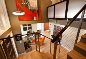
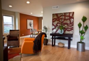
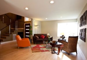
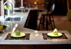
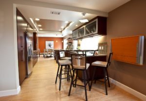
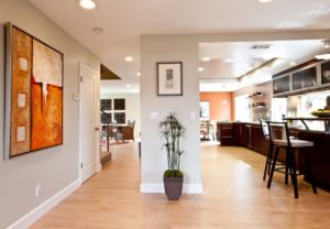
One of the key ambitions of the owners in re-creating this home was to have a space that invites people in, a space that flows from the moment you set foot inside. Throughout the home, allergen collecting carpets were pulled out and replaced with laminate flooring tying all the rooms together with a unified footprint. Every part of the re-created space has been well thought out to maximize the available space. In the entry-way, Royer Designs built custom cubbies for each member of the family. These serve as a place for sorted mail, to empty their pockets, or anything else belonging to each family member that has fond it’s way into the common areas of the home. A formerly period-style wrought iron banister was replaced with a more contemporary cable system that leads up to a custom designed bookcase that provides and artistic element to the space but also functionality where none had existed before. The walls came tumbling down. Without touching the exterior profile of the home the owners strategically removed a couple walls opening up the kitchen to both the dining and family room areas. At one end of the new space, the vintage chandelier that filled the dining room was removed in favor of recessed lighting giving the room a lot more breathable space and the ability to move tables around for entertaining. At the other end of the new space a brick fireplace facade was removed to accommodate a sleeker look, more floor space, and a modern television. Since the old kitchen had a breakfast nook and there was an intimate space for family to gather around a small table, Royer Designs wanted to find a way to bring keep the idea with the home but not waste the space the way the old design had. the owners agreed to be a little experimental. Royer Designs incorporated this objective with the idea of having some bar seating in the space and turned it into a raised round tabletop off the counter with bar-stool seating. This created a multi-use area where kids could do homework, or serve as a buffet filled with platters for entertaining.
